 Kelton Daniels
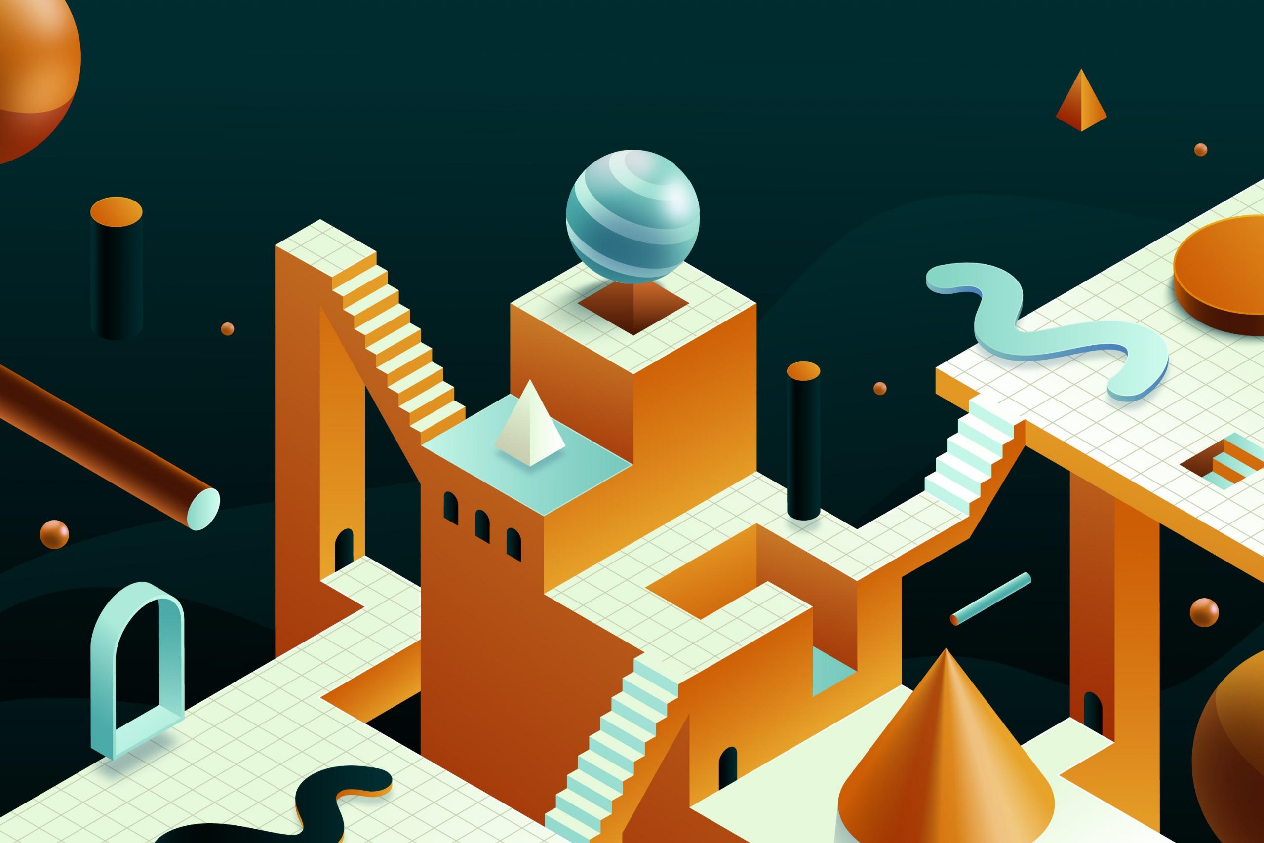
 Exploring the Art of Illusion: How Flat Design Achieves Depth and Visual Hierarchy Without the Use of True 3D Elements
In today’s digital landscape, user interfaces are more than just functional tools—they’re visual experiences that guide, inform, and engage. Among the several design styles available, flat design has emerged as a dominant aesthetic, celebrated for its simplicity, clean lines, and clarity. Unlike traditional designs that may rely heavily on realistic shading, 3D effects, and volumetric elements to convey space, flat design intentionally strips away complexity. So, how does it still manage to create a sense of depth and hierarchy without the aid of genuine three-dimensional techniques?
This article explores the innovative methods and visual techniques that enable designers to craft interfaces appearing layered and dynamic—without using true 3D effects. Understanding these strategies not only enhances aesthetic appeal but also improves usability, guiding users intuitively through content with clarity and elegance.
The Essence of Flat Design and the Challenge of Depth
Flat design prioritizes minimalism and straightforward visual communication. Its core principles involve the use of bold colors, simple typography, and clean icons, often eschewing textures, shadows, and gradients characteristic of skeuomorphic or realistic interfaces.
However, without realistic cues, designers face the challenge of establishing clear visual hierarchy and spatial relationships. If all elements appear flat and on the same visual plane, the interface risks becoming monotonous or confusing, making it harder for users to distinguish primary actions from secondary information. To address this, designers have developed a palette of visual strategies that simulate depth and layering, fundamentally enhancing user experience.
Strategic Use of Color Contrast to Differentiate Planes
Color remains one of the most powerful tools in creating visual hierarchy in flat design. By carefully selecting contrasting colors, designers can guide the user’s eye toward important elements and suggest spatial relationships.
- Foreground vs. Background: Brighter, more saturated colors are often used for primary interactive elements like buttons, calls-to-action, or highlights. Conversely, muted or pastel tones recede into the background, creating a sense of layered depth.
- Color Blocking: Large blocks of contrasting colors can delineate separate sections or layers within an interface, effectively creating implied "layers" despite the absence of shading or shadows.
- Accent Colors: Using accent hues for specific elements draws attention and suggests proximity or importance, helping to organize content hierarchically.
Case Example:
Many modern dashboards rely on color contrast to distinguish data widgets, filters, and navigation menus, guiding users effortlessly through complex information.
Subtle Shadows and Overlays: Mimicking Light and Shadow Play
Although flat design emphasizes minimalism, subtle use of shadows and overlays can greatly enhance depth perception without compromising the aesthetic:
- Drop Shadows: Light, soft shadows beneath elements like cards, buttons, or modals simulate a light source and create the illusion that these elements are floating above the surface.
- Overlay Layers: Semi-transparent overlays can be used to highlight selected elements or separate sections, adding a sense of layering.
- Border and Outline Usage: Thin borders or outlines around components can separate overlapping elements, subtly implying spatial stacking.
Implementation Tips:
Using CSS properties such as box-shadow or filter: drop-shadow() with minimal offsets can increase perceived depth subtly, especially when combined with consistent light source assumptions.
Typography and Spacing: Structuring Content with Visual Cues
Typography and spacing are fundamental to establishing hierarchy and spatial relationships:
- Font Size and Weight: Larger, bolder type often signals primary content, while smaller, lighter fonts serve secondary roles. This differential establishes a clear visual hierarchy.
- Line Height and Letter Spacing: Adequate spacing enhances readability and visually groups related elements, mimicking the spatial separation found in more complex designs.
- Whitespace (Negative Space): Generous whitespace around key elements prevents clutter and helps to separate distinct areas, creating a sense of depth through spatial organization.
Practical Approach:
Designers often utilize nested containers with varying spacing to create implicit "layers," letting some sections appear closer and others recede.
Consistent Framing, Overlapping Elements, and Responsive Layouts
The composition of elements and their arrangement significantly influences perceived depth:
- Framing: Using borders or background containers frames individual elements, highlighting their importance and creating a layered effect.
- Overlap and Z-Index: Overlapping components (e.g., a notification badge over an icon) with carefully managed z-index levels suggests stacking, heightening the sense of spatial relationships.
- Responsive Layouts: Fluid grids and adaptive spacing ensure that the perception of depth remains consistent across devices, further contributing to a cohesive visual hierarchy.
Example:
Mobile app interfaces frequently utilize overlapping buttons and content panels with subtle elevation cues to imply interaction depth.
Case Studies: Flat Design in Practice
1. Google Material Design
While Material Design incorporates depth cues like shadows and elevation, it fundamentally relies on flat design principles—using layered shapes, color contrast, and spacing to create a clear hierarchy without excessive realism.
2. Apple’s iOS Flat UI
Apple’s recent iOS updates favor minimalist icons, flat buttons, and subtle overlays. The strategic use of spacing and contrasting colors creates an interface that feels spacious and intuitive without heavy shading.
3. Web Platforms like Dribbble
Many web-based platforms exemplify layered flat interfaces, employing overlapping components, subtle shadows, and color differentiation to guide users’ attention effectively.
Final Thoughts
The absence of true 3D elements in flat design does not equate to a lack of depth or visual complexity. Instead, it encourages a mindful approach to design, leveraging contrast, overlays, spacing, and layering to craft interfaces that are both beautiful and highly functional. These techniques enhance clarity, direct focus, and improve overall user experience, embodying the principle that less can indeed be more.
Whether developing a sleek mobile app, an engaging website, or a data dashboard, mastering the art of illusion—creating depth without 3D—can elevate your designs from flat to phenomenal. By understanding and applying these visual strategies, designers can achieve rich, engaging interfaces that feel intuitive and modern, all while maintaining the elegance of minimalist aesthetics.
In the world of flat design, depth is not just an illusion—it’s an art form. When skillfully executed, it turns simple visuals into compelling experiences that users love to engage with.